Specifying custom properties
Each preset component has a set of preset properties that you can specify values for. You can add custom properties that would not otherwise exist for a particular component type. You bind the properties to dynamic expressions to define global properties for a component that can be read by other components. For example, you can specify global properties for the root component that you can use in the child components.
For example, to specify spacing between UI elements, you could define a margin for a component that does not have a margin property, and then use bindings to refer to the value of the margin property from other components.
Similarly, you can add custom properties for your own components that are based on preset components.
Any content that is data-driven should be exported as a public property (alias property) of the relevant component. For example, a speedometer should have an int or real property for speed to which the UI is bound.
Adding properties for a component
To add a custom property for a component:
- Go to the Local Custom Properties section in the Properties view.
- Select the
 (Add) button to add a custom property for the currently selected component.
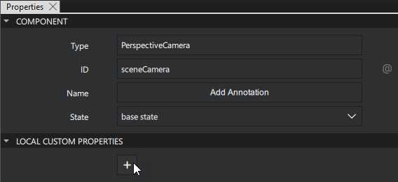
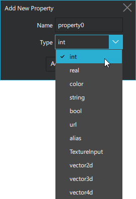
- Set the Name and Type for the property.
Binding a property value
To bind the value of the property to that of another one or to data accessible in the application:
- In the Properties view, select
 next to the property.
 - Select Set Binding.
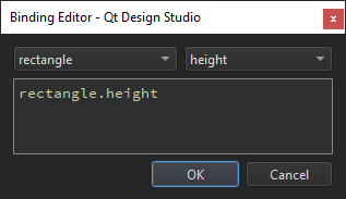
For more information, see Setting bindings.
Adding a custom property to a component in the Connections view
To add a custom property to a component in the Connections view:
- Select the component you want to add a Custom property to in the 2D view or in the Navigator view.
- Select Properties from the Connections view.
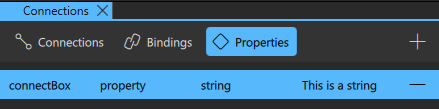
- Select the (Add) button to add a Custom property.
- From the pop-up Custom property editor, select the Type of the property you want to include.
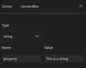
- Next, set the Name of the property.
- Set a value to the Custom property in the Value field.
Note: Select the  (Remove) to delete a Custom Property.
Supported property types
The following table describes the supported property types:
| Type | Description |
|---|---|
| alias | Property alias that holds a reference to another property |
| bool | Binary true or false value |
| color | Color value that can be specified by using an SVG color name, such as "red", "green", or "lightsteelblue", or a hexadecimal triplet or quad in the form "#RRGGBB" and "#AARRGGBB", respectively. For example, the color red corresponds to a triplet of "#FF0000" and a slightly transparent blue to a quad of "#800000FF". In addition, you can use the following Qt functions: Qt.rgba(), Qt.hsva(), Qt.hsla(), Qt.darker(), Qt.lighter(), and Qt.tint(). |
| int | Whole integer number, such as 0, 10, or -20 |
| real | Number with a decimal point |
| string | Free form text string |
| TextureInput | Specifies a texture exposed to the shaders of a CustomMaterial or Effect. |
| url | Resource locator, such as a file name. It can be either absolute, (http://qt-project.org), or relative (pics/logo.png). A relative URL is resolved relative to the URL of the parent component. |
| variant | Generic property type. For example, variant properties can store numbers, strings, objects, arrays, and functions. |
| vector2d | Refers to a value with x and y attributes. |
| vector3d | Refers to a value with x, y, and z attributes. |
| vector4d | Refers to a value with x, y, z, and w attributes. |
See also Specifying component properties.
Available under certain Qt licenses.
Find out more.
