Text
You can use several different text components to add read-only or editable text to a UI, such as titles or labels and text input fields with placeholder text. The Text component adds formatted text, the Text Edit component adds a multiline line edit, and the Text Input component adds a single editable line field.
You can select the font to use and specify extensive properties for each text string, such as size in points or pixels, style name, emphasis, alignment, and spacing.
For more information, watch the following video:
To create a label with a background, use the Label component available in Components > Qt Quick Controls. The module also contains components for creating Text Field and Text Area controls. They differ from the basic components in that a common style is applied to them and that you can specify placeholder text for them.
Using rich text
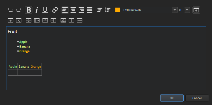
You can use rich text in the Text and Text Input components. To open the rich text editor, select the  (Edit) button in Properties > Character > Text.
In the rich text editor, you can:
- Emphasize text.
- Create hyperlinks.
- Align text.
- Create bulleted and numbered lists.
- Specify text color.
- Select text font.
- Set font size.
- Create tables.
Marking strings for translation
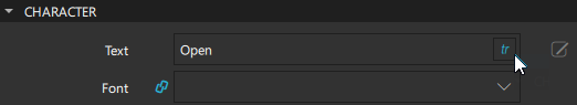
To support translators, mark the strings that should be translated. In Properties > Character > Text, select tr.
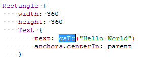
By default, the text string is enclosed in a qsTr() call.
If you use text IDs instead of plain text, change the default call to qsTrId(). Select Edit > Preferences > Qt Quick > Qt Quick Designer, and then select the qsTrId() radio button in the Internationalization group. For more information, see Text ID based translations.
To preserve the context when editing the text or to change the context by setting a binding on the text property, change the default call to qsTranslate() by selecting the qsTranslate() radio button.
For more information, see Mark Strings for Translation.
Character properties
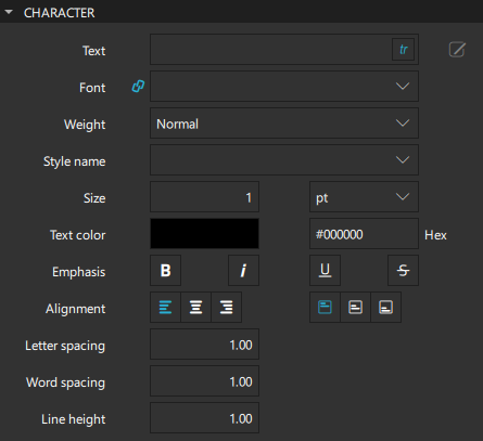
You can set font properties in the Character section in Properties. For each string that you enter in the Text field, you can select the font to use in the Font field and specify the size, emphasis, aligment, and spacing of the text. Specify the font size in either points or pixels in the Size field.
To display custom fonts in the list of available fonts in the Font field, you need to first add them to Assets:
- Select Assets >
 .
. - Select the font file, and then select Open.
- Select the location where the file will be saved in the Add Resources dialog.
- Select OK.
In the Weight field, you can select the font weight from a list of predefined values that range between extra-light and extra-bold. You can also use the buttons in the Emphasis group to format text by making it bold, italic, underlined, or strikethrough.
If you set a style name in the Style name field, the font is matched against the style name instead of the values set in the Weight and Emphasis fields.
The value of the Word spacing field changes the default spacing between individual words, whereas the value of the Letter spacing field changes the spacing between individual letters in a word. A positive value increases the spacing by a corresponding amount of pixels, while a negative value decreases it.
The value of the Line height field sets the line height for the text. In the Line height mode field in the Text Extras section, select FixedHeight to set the line height in pixels or ProportionalHeight (default) to set the spacing proportionally to the line (as a multiplier). For example, set to 2 for double spacing.
Text alignment
You can align text components horizontally and vertically. By default, text is vertically aligned to the top. Horizontal alignment follows the natural alignment of the text. By default, left-to-right text like English is aligned to the left side of the text area, whereas right-to-left text like Arabic is aligned to the right side of the text area.
You can align text to the left, right, top, or bottom, and center it horizontally or vertically. You can justify horizontal text.
For a single line of text, the size of the text is the area of the text. In this common case, all alignments are equivalent. To center a text in its parent, use anchoring or bind the width of the text component to that of the parent. For more information, see Setting bindings.
Text and style colors
You can set the color of the text itself and a secondary color used by text styles.
For the Text Edit and Text Input components, you can also set the color of selected text and the text highlight color that is used behind selections in the Selected text color and Selection color fields.
For the Text Field and Text Area controls, you can also set the color of the placeholder text.
For more information about selecting colors, see Picking Colors. You can only set solid colors for text components.
Advanced text properties
The height and width of a text component are determined automatically depending on the values of the properties you set, to accommodate the length of the string that you specify in the Text field and the font size, for example. You can specify additional properties for formatting text in the Text Extras section.
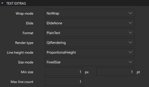
The value of the Size mode field specifies how the font size of the displayed text is determined. Select FixedSize to use the size specified in the Size field in the Character section in pixels or points.
Select HorizontalFit or VerticalFit to use the largest size up to the size specified that fits the width or height of the component. Select Fit to use the largest size up to the size specified that fits within the width and height of the component. The font size of fitted text has a minimum bound specified by the Min size field and maximum bound specified by the Size field.
Wrapping and eliding text
In the Wrap mode field, you can wrap the text to the text component's width. The text will only wrap if you set an explicit width for the text component. By default, text is not wrapped. Select WordWrap to restrict wrapping to word boundaries only. Select WrapAnywhere to enable wrapping at any point on a line, even if it occurs in the middle of a word. Select Wrap to wrap at a word boundary, if possible, or at the appropriate point on the line, even in the middle of a word.
You can use the Elide property with the Wrap option to fit a single line of plain text to a set width. Select ElideRight, and set the Max line count or the text component height (in the H field). If you set both, the maximum line count will apply unless the lines do not fit in the height allowed.
If the text is a multi-length string, and you set the Elide property value to something else than ElideNone, the first string that fits will be used, otherwise the last will be elided.
Multi-length strings are ordered from longest to shortest, separated by the Unicode String Terminator character U009C.
Formatting text
Text can be either in plain text or rich text format, depending on the value you set in the Format field. If you select AutoText and the first line of text contains an HTML tag, the text is treated as rich text. Rich text supports a subset of HTML 4 described on the Supported HTML Subset. Note that plain text offers better performance than rich text.
Rendering text
In the Render type field, you can override the default rendering type for a text component. Select NativeRendering if you prefer text to look native on the target platform and do not require advanced features such as transformation of the text. Using rotation or scaling in combination with native rendering leads to poor and sometimes pixelated results.
If you select NativeRendering, you can set the hinting preference in the Hinting field in the Font Extras section:
- PreferDefaultHinting uses the default hinting level for the target platform.
- PreferNoHinting renders text without hinting the outlines of the glyphs, if possible.
- PreferVerticalHinting renders text with no horizontal hinting, but aligns glyphs to the pixel grid in the vertical direction, if possible.
- PreferFullHinting renders text with hinting in both horizontal and vertical directions.
Note: This property only describes a preference, as the full range of hinting levels are not supported on all of Qt's supported platforms.
Advanced font properties
You can specify additional properties for fonts in the Font Extras section.
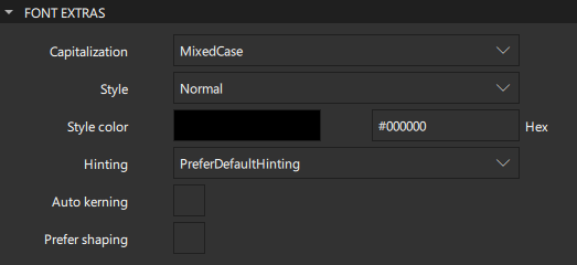
In the Capitalization field, select MixedCase for normal text rendering where no capitalization changes are applied. You can also set the text in all upper or lower case, or use small caps. The Capitalize option renders the first character of each word as an uppercase character.
You can set the font style in the Style field to Outline, Raised, or Sunken. The color that you pick in the Style color field is used as the outline color for outlined text, and as the shadow color for raised or sunken text.
To use kerning when drawing text with the selected font, select the Auto kerning check box.
Sometimes, a font will apply complex rules to a set of characters in order to display them correctly. In some writing systems, such as Brahmic scripts, this is required in order for the text to be legible but in others, such as Latin script, it is merely a cosmetic feature. Such features are disabled by default to improve performance. If they are required, select the Prefer shaping check box.
Text Input
You can use the Text Edit and Text Input components to add text fields where users can enter text.
The Text Input component displays a single line of editable plain text, whereas the Text Edit component displays a block of editable, formatted text. Both components are used to accept text input.
Entering passwords
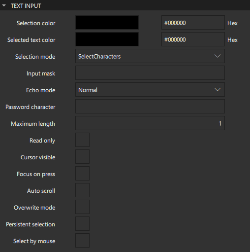
You can set properties for Text Input components that make them suitable for entering passwords.
In the Input mask field, you can create an input mask that contains mask and meta characters and separators between them. When created or cleared, the text edit or input is filled with a copy of the input mask string, where the meta characters have been removed, and the mask characters have been replaced with the blank character. For example, in an input field for an IP address, you could use the following mask (with the underscore as the blank character): 000.000.000.000;_. For more information about creating input masks, see the documentation for QLineEdit::inputMask.
In the Echo mode field, select Password to display platform-dependent password mask characters instead of the actual characters that users enter. Select PasswordEchoOnEdit to display characters as users enter them. The mask character is displayed in the Password character field.
Entering text
You can specify how users can enter text into text edit or input fields.
In the Maximum length field, set the maximum number of characters that users can enter.
The value of the Auto scroll check box determines whether the text edit or input should scroll when the text is longer than the width of the field.
If the Overwrite mode check box is selected, existing text is overwritten, character-for-character by new text. Otherwise, new text is inserted at the cursor position, displacing existing text. By default, new text does not overwrite existing text.
To prevent users from changing the text, select the Read only check box.
Selecting text
In the Selection mode field, you can specify whether individual characters or whole words are selected when selecting text with a pointer device.
Select the Select by mouse check box to enable users to use the mouse to select text in some platform-specific way. For some platforms this may not be an appropriate interaction because it may conflict with how the text needs to behave inside a Flickable component, for example.
For a Text Edit component, you can select the Select by keyboard check box to enable users to use the keyboard to select text even if the edit field is read-only. If this property is set to false, users cannot use the keyboard to select text even if it is editable.
Focus
The value of the Focus on press check box determines whether the text edit or input should gain active focus on a mouse press.
By default, the cursor becomes visible when the text edit or input gains active focus, so that other properties can be bound to whether the cursor is currently shown. Because the value of the Cursor visible property gets set and unset automatically, any value you set yourself may be overwritten.
If the Persistent selection check box is selected, a text edit or input keeps its selection when active focus moves to another component.
Tabs and margins
You can specify additional properties for formatting a block of text in a Text Edit component.
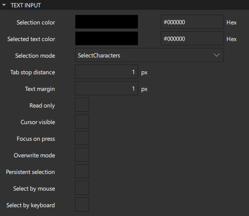
In the Tab stop distance field, set the default distance, in device units, between tab stops.
In the Text margin field, set the margin around the text in pixels.
Padding
The values of the properties in the Padding section specify the padding around the content. The individual padding properties adopt the value of the Global field, unless you set them explicitly.
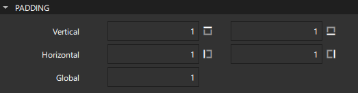
Note: If you explicitly set the width or height of a text edit or input, ensure that it is large enough to accommodate the padding values. If the text does not have enough vertical or horizontal space in which to be rendered, it will appear clipped.
Placeholder text
For Text Field and Text Area controls, you can specify text to display in a field before users enter text into it. Specify the text in the Placeholder text field and its color in the Placeholder color field.
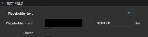
Select the Hover check box to enable the text field to accept hover events.
Summary of the text components
The following table lists the components that you can use to add text to UIs. The Location column contains the tab name where you can find the component in Components. The MCU support column indicates which components are supported on MCUs.
| Icon | Name | Location | MCU support | Purpose |
|---|---|---|---|---|
 | Label | Qt Quick Controls | No | A text label with inherited styling and font. |
| [Missing image text-icon16.png] | Text | Default Components - Basic | Yes | Formatted read-only text. |
 | Text Area | Qt Quick Controls | No | Multiple lines of editable formatted text. |
| [Missing image text-edit-icon16.png] | Text Edit | Default Components - Basic | No | A single line of editable formatted text that can be validated. |
 | Text Field | Qt Quick Controls | No | A single line of editable plain text. |
| [Missing image text-input-icon16.png] | Text Input | Default Components - Basic | No | A single line of editable plain text that can be validated. |
Available under certain Qt licenses.
Find out more.
