Properties
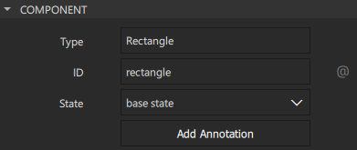
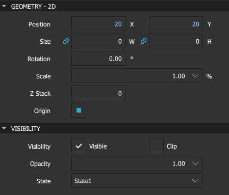
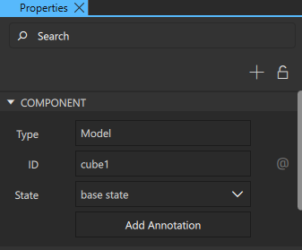
The Properties view displays all the properties of the selected component. The properties are grouped by type. The top part of the view displays properties that are common to all components, such as component type, ID, name, geometry, and visibility.
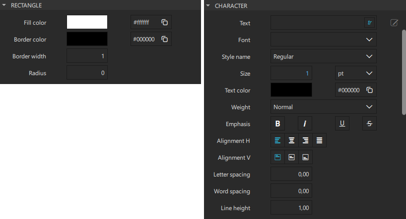
The bottom part of the view displays properties that have been defined for the component type. For example, the following image displays the predefined properties you can set for Rectangle and Text components.
Custom properties
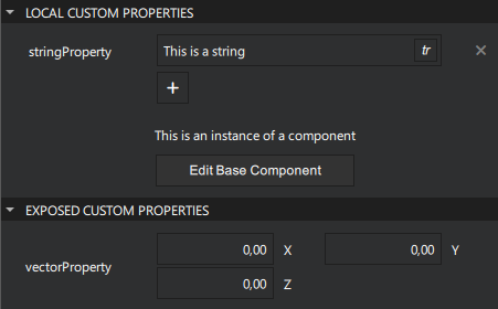
Custom Properties are properties that the user has added to the component.
There are two types of custom properties:
| Custom property type | Description |
|---|---|
| Local Custom Property | A property that has been added for a preset component. |
| Exposed Custom Property | A property that has been added inside a component. |
Viewing changes in properties
The default values of properties are displayed in white color, while the values that you specify explicitly are highlighted with blue color. In addition, property changes in states are highlighted with blue.
This allows you to easily see which values are set in the component file for this component instance and which values are default characteristics of a component.
When editing states, you can easily see which values are explicitly set in the current state and which values are derived from the base state.
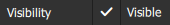
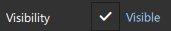
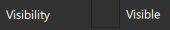
The following images illustrate this. In the base state, the Position and Size values are explicitly set and highlighted.
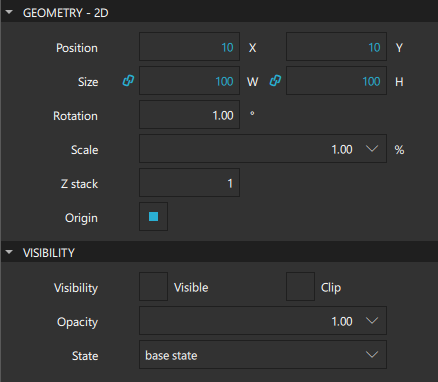
In State1, only Position is explicitly set and highlighted.
Resetting a property sets it back to the default value and removes the value from the component file.
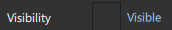
Note: As a result, all boolean values can be visualized in four different ways.
For example, visibility can be visualized as follows:
| TRUE | The component is visible by default. The visibility might be overridden by the visibility set in the base state. |
| TRUE (highlighted) | The component is explicitly set to visible. |
| FALSE | The component is hidden by default. The visibility might be overridden by the visibility set in the base state. |
| FALSE (hightlighted) | The component is explicitly set to hidden. |
Multiselection
To modify the values of common properties of multiple components simultaneously, select the components in the Navigator, 2D or 3D view:
- On Windows, select and hold Ctrl and Shift, and then click the components to select them.
- On macOS, select Shift to select a range of components or Cmd to select multiple single components.
You can lock other components in Navigator to make multiselection easier.
Editing properties in multiple views
Note: Editing properties in multiple views is only possible in 3D projects. See Creating Projects.
You can open multiple Properties views to edit the properties of multiple nodes simultaneously. You can lock each of the Properties views to prevent the subject node from changing by each selection.
To edit properties in multiple views, you first need to enable Multi Property Editor:
- Select Help > About Plugins, and then select Multi Property Editor.
- Restart Qt Design Studio.
To edit the properties of multiple nodes simultaneously:
- In Navigator, select any node and open the Properties view to edit its properties.
- In Properties, to open another Properties view for editing properties of another node:
- Select
 to prevent the subject node from changing in this Properties view.
 - In Navigator, select another node.
- In Properties, select
 to edit its properties in another Properties view.
- Select
- Edit the properties in each of the Properties views as needed.
Getting help for properties
- For information about setting common component properties, see Specifying component properties.
- For more information about the properties available for a component, select F1 or see Component types and Scalable layouts.
Available under certain Qt licenses.
Find out more.
